Shares

A Style Guide for Contact Lens Branding

Published Feb 7, 2025

Contact lens branding has traditionally been fairly uniform, with many brands sharing similar design elements.

Cover: Dimple Branding by Universal Favourite

These common visual aspects are typically focused on conveying a message of comfort, hydration, and hygiene—key qualities that consumers look for in contact lenses when thinking about eye health and convenience in their daily routines. These themes are consistently seen throughout online shops and product packaging in an effort to immediately communicate these features.

However, with more creative and vibrant packaging trends on the rise, contact lenses are adapting to these new motifs while remaining true to the shared message most, if not all, contact lens brands wish to express to shoppers.

Here’s a look at the current state of contact lens branding.

Common Design Motifs

Contact lens branding often focuses on conveying comfort and moisture, which is reflected in common design elements. Many brands use similar color schemes, imagery and shapes to assure consumers that their contacts are high-quality.

The selection of contact lenses on popular online stores like Target Optical clearly showcases these shared design elements used by major brands. Contact lenses like the Acuvue Oasys from Johnson & Johnson and the Dailies Aquacomfort Plus from Alcon use blue, white or turquoise colors that often express calm, purity and cleanliness, immediately telling consumers that the contacts will offer the same experience.

Blue is also commonly associated with trust, making consumers feel more confident about purchasing from a reliable brand. The imagery of water or curved lines can indicate hydration, a crucial component that ensures contact lenses stay comfortable on the eye. Simple fonts, typically sans serif ones, keep the design simple and clean.

Other brands like Biotrue and Biofinity don’t use these common motifs but retain the message of cleanliness and reliability through minimalistic design and cool color schemes like green and purple. Curved lines and round shapes also evoke feelings of comfort and softness, as opposed to angular lines that look sharp.

These inviting details allow contact lens consumers to feel confident in purchasing a clean and trusted brand, and it can be more appealing to first-time wearers who may still be apprehensive about trying them out. 

Disrupting Contact Lens Branding

While common motifs present in a lot of contact lens branding are tried and true, many companies are now seeking to stand out on the shelves using striking visual elements that still convey the same messages while looking more creative and unique.

Contact lens and hyaluronic acid brand Kilala uses different design approaches for each one of their collections, but still retains a fresh and bubbly visual language throughout their packaging. The Poompoom Hyaluronic Acid collection is inspired by balloons, and the translucent, pastel-colored ones on the packaging give the impression of hydration and elasticity, bringing to mind the thin and light sheen of contact lenses.

Their fruit-themed colored contact lens collection uses bright color schemes and low-poly fruit illustrations to communicate fun without sacrificing contact lens imagery.

Australia-based Dimple, a direct-to-consumer daily contact lens subscription service, uses bold colors and shapes to make the brand feel more friendly and approachable rather than sterile.

The design elements, like circles with different hues and patterns, also serve a purpose. The various designs are inspired by how people tend to have different prescriptions for each eye, and the circles correspond to each power number. By displaying them on each blister pack, consumers can have an easier time identifying which contact goes in which eye, and the eye-catching details stand out when they aren’t wearing glasses or contacts.

Contact lens branding has certainly evolved throughout the years, adapting to design trends and addressing common design flaws to make the experience less daunting and more pleasant.

While brands have different approaches to elements and details, the message of cleanliness, trust and comfort has often remained the same.

For more branding inspiration and guides like this, check out our previous features here.

POSTED BY

IG Team

Shares

More articles

Muzli launches a new space for creatives with “Muzli Me”

ONEXSUGAR 1: This Shape-Shifting Dual-Screen Handheld Launches on Indiegogo July 21

Ayaneo Launches Flip 1S DS and KB: Pre-Orders Open Now, Shipping in September

Why the Arzopa Z1RC is the Best Portable Monitor for Nintendo Switch 2

#want

PenTips 2+ Apple Pencil Tips

dbrand Switch 2 Killswitch Case

Paperlike Bumper Case for iPad

Skull & Co. GripCase for ROG Ally X

Inspiration Grid Classic Snapback Cap

XPPen Artist Pro 22 (Gen 2) Pen Display Tablet

These are affiliate links to Amazon and other partner brands. We may earn a small commission if you click the link and make a purchase.
There is no extra cost to you, so it’s just a nice way to help support the site.

More inspiration

Everyday Magic: The Joyful Illustrations of Kenzo Hamazaki

Brazilian illustrator Kenzo Hamazaki brings a sense of wonder to the everyday through his joyful and vibrant creations.

Color, Code & Composition: Manoloide’s Digital Creations

Argentinian artist and creative coder Manolo Gamboa Naon, better known as Manoloide, uses clever programming to create mesmerizing generative visuals.

The Expressive Fantasy Realms of Yao Yao

Chinese concept artist and character designer Yao Yao crafts engaging characters and fantastical worlds that feel straight out of a dream.

Creepy & Cute Collectibles: The Strange Sculptures of Cocoon Toy

Ukrainian artists Anna Lesnichaya and Ivan Grodzensky are the creative minds behind Cocoon Toy, a growing collection of handcrafted art toys that blend eerie charm with unexpected warmth.

More

articles

Why the Arzopa Z1RC is the Best Portable Monitor for Nintendo Switch 2

Read it

Ayaneo Launches Flip 1S DS and KB: Pre-Orders Open Now, Shipping in September

Read it

ONEXSUGAR 1: This Shape-Shifting Dual-Screen Handheld Launches on Indiegogo July 21

Read it

Muzli launches a new space for creatives with “Muzli Me”

Read it

Inspiration
in your inbox

Amazing art & design, never any spam.

Thanks for subscribing!
We'll be in touch soon.

We care about protecting your data. Please refer to our Privacy Policy for more.
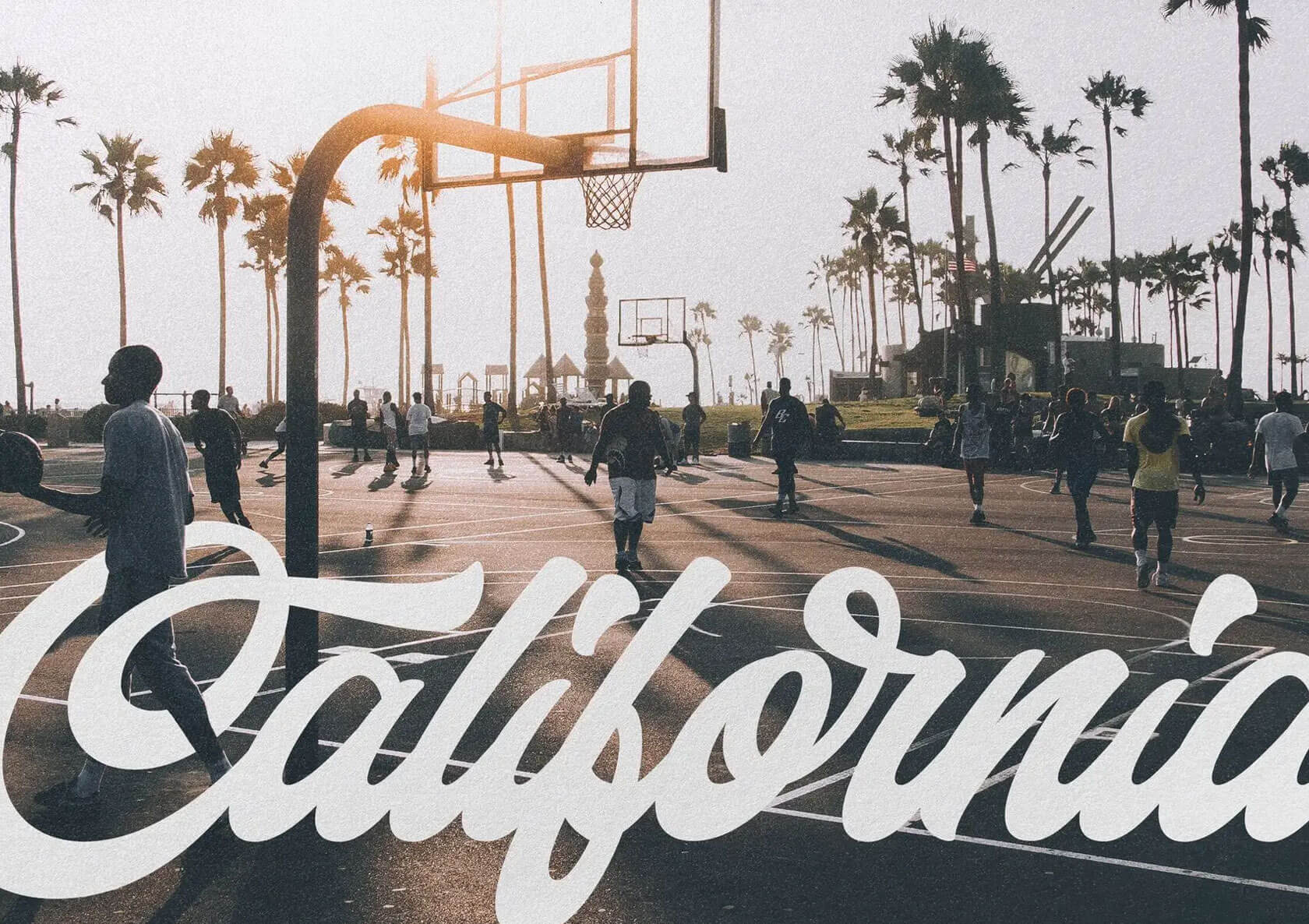


© 2025 Inspiration Grid, all rights reserved. Some of our posts may contain affiliate links to partner brands. We earn a small commission if you click the link and make a purchase. There is no extra cost to you, so it’s just a nice way to help support the site. All images, videos, and other content posted on the site is attributed to their creators and original sources. If you see something wrong here or you would like to have it removed, please contact us.